Nou Design Studio
Purpose & Planning
This project was made to market and showcase projects to potential clients of the business. It lists the services, creatively displays previous projects and provides a form for enquiries
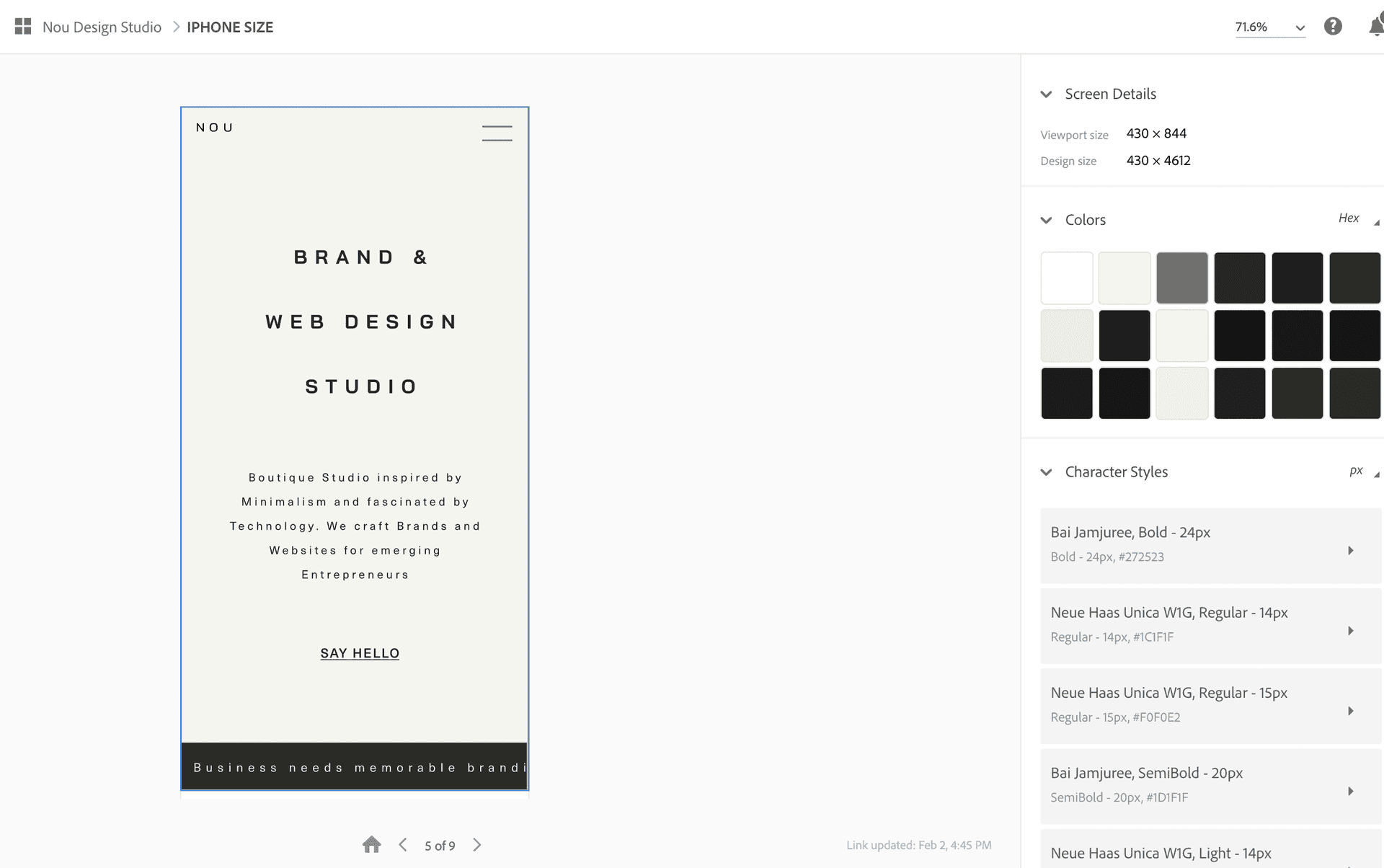
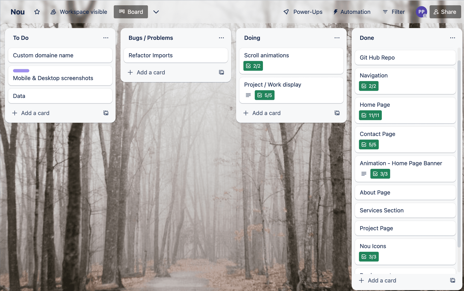
I've worked to the clients designs from Adobe XD, to create a webpage that is fully responsive. Workflow was managed with a Trello Kanban board, outlining an MVP then breaking down goals into actionable tasks. While Version control was managed with GitHub, including feature branches to avoid breaking commits to the main branch.
Stack
- React
Next.js
- CSS
Vercel
- Javascript ES6
This website is built with React and Next.js. Next enabled development and deployment features like automatic code spliting, lazy loaded & optimised images with improved SEO. Allowing me to deliver a performant website with excellent user experience.
Next also meant Vercel was used for deployment, meaning I could utilise separate production and feature deployments alongside version control.
Features & Challenges
Animations
Parallax scrolling was used with CSS transitions to add fliar to the site. I also chose to use an the web animation API with an intersection observer to allow element animation according to viewport position and improved perfomance.
This was tricky as I wanted different elements to fade in with varied timings. Therefore had to use callback functions on elements to create create an array of Refs and iterate over in the observer. This allowed me to animate elements on entering the viewport and apply delays based on tag names, giving a more polished UI.
Responsive layouts
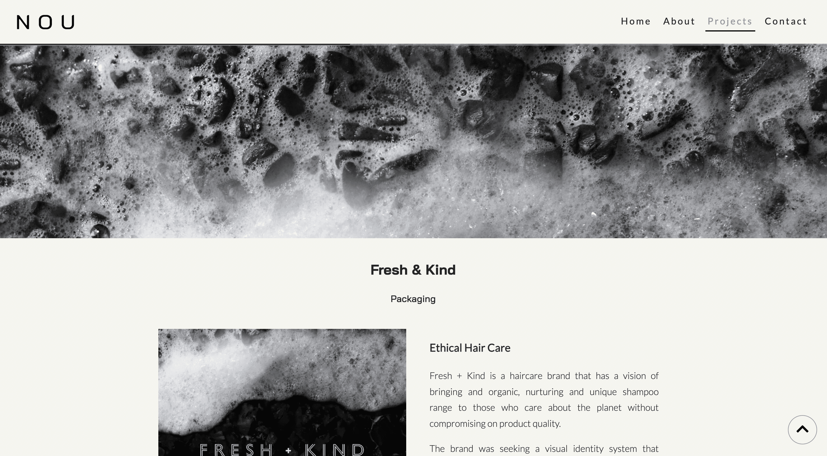
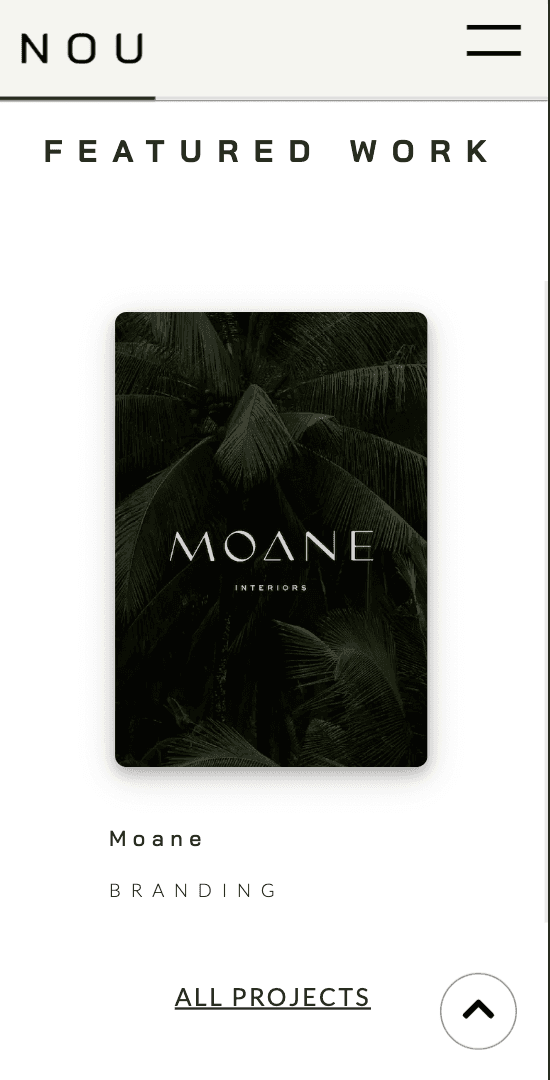
Getting the site to be responsive at all screen sizes, meant needing to utilize layout tools like Grid and Flexbox. Media queries were also useful to define breakpoints but I tried to implement modern CSS functions like clamp / min, to create responsive text and layouts without media queries.
Contact Form
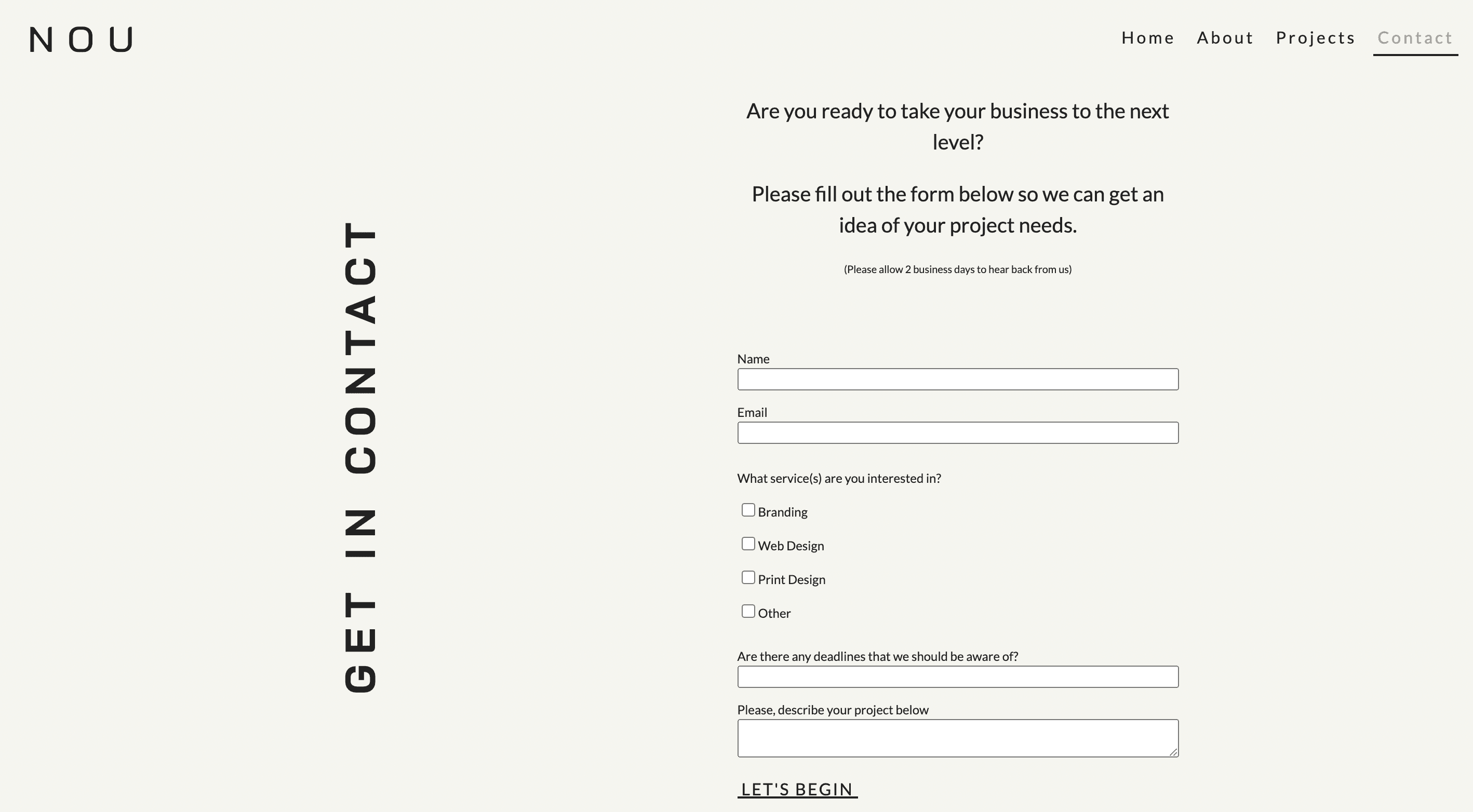
The useState hook allowed a controlled form with validation for user input, including a Regex pattern for email inputs. I was able to make use of the in built next js API. This allowed me to handle form submission of user data with the node mailer library.
What I learned
Through this project I've learned how to create a performant site with smooth animations and elements that react to scroll position. Using high quality images meant learning about optimisation including tools such as ImageOptim and next gen formats like WebP.
This involved becoming familiar Dev tools and Lighthouse to inspect requests / audit performance. A valuable takeaway was learning how to simulate slow networks for mobile devices.
I also learned how to handle user inputs with email submission through node mailer and increased my understanding of responsive design with layout tools like CSS grid.